The choice of the colours of disposable table linen is crucial in order to maximise the results of sales to the final customer: it is better to take advice from the experts
Trends, seasons, combinations, emotions and traditions: there are many factors that influence the choice of colours of disposable tablecloths, runners and placemats. The choice of colours and combinations is a crucial factor to obtain good sales results with the final customer. It is better to rely upon specialised manufacturers, who are able to offer advice on the range of colours to display in the store. For over 20 years we have devoted ourselves to the production of disposable table linen, which is sold in numerous European countries. Our high level of product specialisation enables us to offer advice to our customers, to guide them in the choice of the range of colours when defining the assortment.
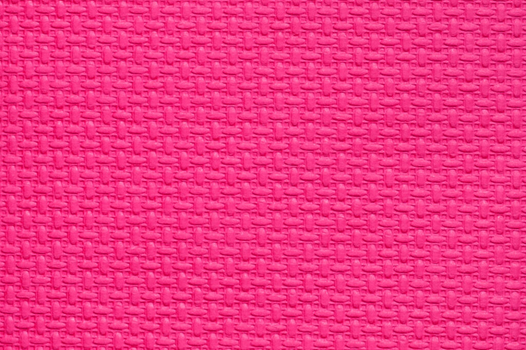
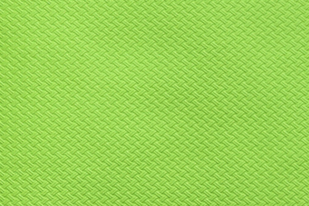
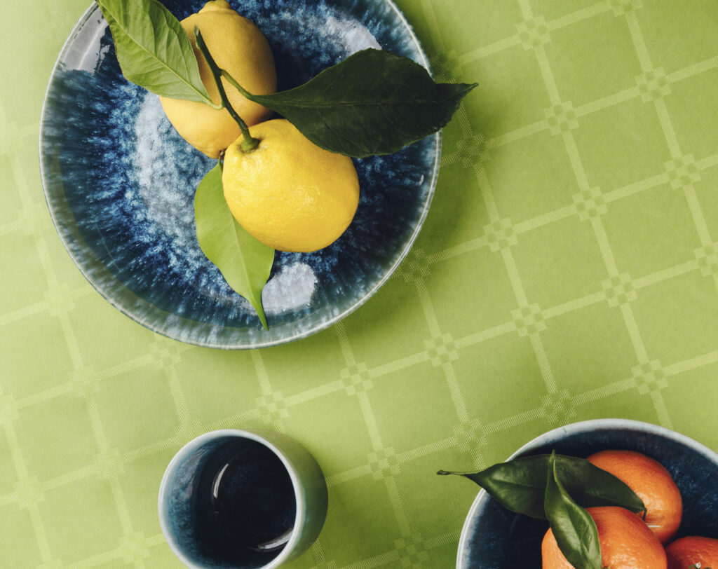
The consumer is attracted by trendy shades, by original combinations, by shades that reflect the season or in line with local tastes. Different countries, different customs, as the saying goes: each market has different needs, above all when it comes to events and festivities. Our tablecloths are available in a range of 25 shades. Here is a small selection of colours we recommend for the summer: Tiffany green, with cool nuances of turquoise and aquamarine, intense fuchsia, mint green and yellow, dazzling and joyful like the sun. These are colours that transmit energy, optimism and good vibes typical of summer.
Combinations make a great difference to the perception of colours and the feelings they inspire, and so coordinating table linen with other elements of the table setting requires great care. For example, yellow works well with grey if wishing to play with the contrast between the cheerfulness of the former and the solidity of the latter, as suggested by the choice of Pantone colors of the year 2021, or it can be combined with mint green for a very refreshing effect. Tiffany can be combined with dove grey to obtain a result that is elegant, but young and lively. A sophisticated combination is that of mint green, tone on tone with emerald green, for an immersion into nature. Fuchsia is at its best if coordinated with contrasting colours, such as emerald green or violet.
Contact us for information on our advisory service for the choice of colours and their combinations, and the possibility of producing assorted two colour “Combo” boxes.